I like this viz also, Mike! However, I think you need some more context in your caption. Specifically, could you please comment on when the modern Democrat and Republican parties came into being? Here's what I mean: Democrats and Republican platforms and values today are not what they once were. In fact, if memory serves, they were once kind of the opposite of what they are today. In any case, some more context would do so that people who don't know this aren't misled.
This is awesome Mike! I've actually done something similar, going back to George Washington's re-election and incorporating a couple metrics. But it wasn't done in Tableau, so it isn't as pretty.
I'd like to share it with you and together we could update this dashboard.
Thanks Greg! I'd love to take a look at your dashboard. I haven't done anything extra ciricular for a few months and this would be a nice excuse. FYI - The New York Times published something similar just before the election. Here's the link to that. It's pretty cool. http://www.nytimes.com/interactive/2012/10/15/us/politics/swing-history.html
well, as I mention, it wasn't done in Tableau- so there's no dashboard. My first inclination isn't to use Tableau, as I'm still learning about its capabilities.
What I did was look at presidential elections for each decade and divide the US map accordingly- each state was cut in half or in thirds. Then I colored each setion corresponding to which party won that state-similar to what you and Times did.
I tracked the electoral college vote for each state- which could change with every census taken at the beginning of a decade, hence why I focused on 10 year intervals.
In this way, it was a rudimentary population change indicator, but clearly there are limitations. For instance, 1 electoral vote in Jefferson's day doesn't correspond to the same population as 1 electoral vote does today. But it was a start to answering the question: do more populous states become more liberal over time?
So I ranked the 5 most populous states-again by using their electoral votes, for each decade.
As I said, it's not as nice to look at as this but more concisely conveys the results of each election.
Oh, and it's in PowerPoint. I had two US map templates that I colored in paint from each election's results. Definitely not the most efficient use of my time, but I got it done!
Demanding advanced solutions to your tech issues? Don’t worry!! Simply dial our QuickBooks POS Support Contact Number +1(844)233-3033 and get all your queries settled simultaneously.Our experts are skilled & competent enough to handle any type of complex & non-complex doubts.
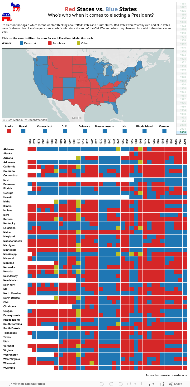
Nice Viz! Would be pretty cool to add the Year to the Pages shelf, and animate the changes to see the patterns in voting over time.
ReplyDeleteI like this viz also, Mike! However, I think you need some more context in your caption. Specifically, could you please comment on when the modern Democrat and Republican parties came into being? Here's what I mean: Democrats and Republican platforms and values today are not what they once were. In fact, if memory serves, they were once kind of the opposite of what they are today. In any case, some more context would do so that people who don't know this aren't misled.
ReplyDeleteNice work Mike! I love the simplicity!
ReplyDeleteThis is awesome Mike! I've actually done something similar, going back to George Washington's re-election and incorporating a couple metrics. But it wasn't done in Tableau, so it isn't as pretty.
ReplyDeleteI'd like to share it with you and together we could update this dashboard.
Thanks Greg! I'd love to take a look at your dashboard. I haven't done anything extra ciricular for a few months and this would be a nice excuse. FYI - The New York Times published something similar just before the election. Here's the link to that. It's pretty cool. http://www.nytimes.com/interactive/2012/10/15/us/politics/swing-history.html
Deletewell, as I mention, it wasn't done in Tableau- so there's no dashboard. My first inclination isn't to use Tableau, as I'm still learning about its capabilities.
DeleteWhat I did was look at presidential elections for each decade and divide the US map accordingly- each state was cut in half or in thirds. Then I colored each setion corresponding to which party won that state-similar to what you and Times did.
I tracked the electoral college vote for each state- which could change with every census taken at the beginning of a decade, hence why I focused on 10 year intervals.
In this way, it was a rudimentary population change indicator, but clearly there are limitations. For instance, 1 electoral vote in Jefferson's day doesn't correspond to the same population as 1 electoral vote does today. But it was a start to answering the question: do more populous states become more liberal over time?
So I ranked the 5 most populous states-again by using their electoral votes, for each decade.
As I said, it's not as nice to look at as this but more concisely conveys the results of each election.
Oh, and it's in PowerPoint. I had two US map templates that I colored in paint from each election's results.
Definitely not the most efficient use of my time, but I got it done!
A1 Trainings
ReplyDeleteTableau Online Training in Hyderabad
Demanding advanced solutions to your tech issues? Don’t worry!! Simply dial our QuickBooks POS Support Contact Number +1(844)233-3033 and get all your queries settled simultaneously.Our experts are skilled & competent enough to handle any type of complex & non-complex doubts.
ReplyDelete