One of the most popular data visualization techniques enabled by the proliferation of data visualization software is to show a map with color filled regions based on some data point that is tied to that region. The most prominent examples are the red state/blue state maps that we see every time we have a national election.
Yesterday Dan Murray from Interworks was speaking to the Nebraska chapter of DAMA (Data Management International) about data visualization and said that color, shape, size, and position helps data information standout. No data visualization technique makes better use of color, shape, size and position than a color filled map.
This week Tableau 7.0 was released which includes new visualization features including the ability to create filled maps. This data visualization technique is also known as geo-mapping and thanks to the new Tableau release all of us have the ability to create beautiful color filled maps that can help influence and tell stories. You could call it "geo-fluence" and it can be a very powerful tool that can tell vastly different stories depending on how you apply it.
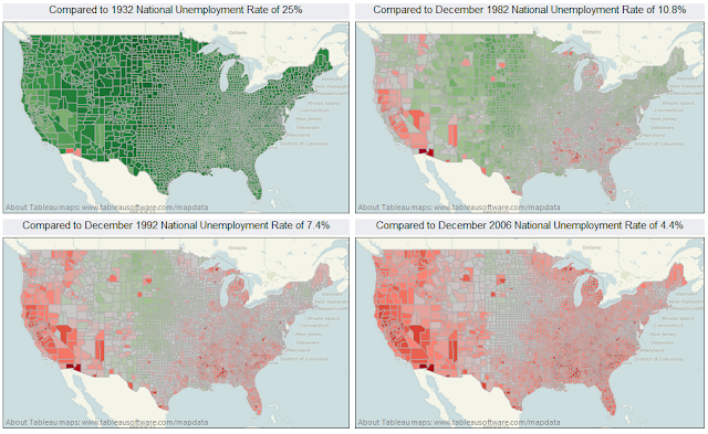
To illustrate this point I took October 2011 unemployment rates by county that I got from the Bureau of Labor Statics and loaded them into Tableau. Then I created four views that compares the unemployment rates by county to the national average from four different time periods. The first time period compares 2011 unemployment rates to the 25% unemployment rate at the height of the Great Depression. The second map compares 2011 unemployment rates to the recession which ended in November 1982. The third map compares unemployment rates to rates just before the start of Bill Clinton's first term and the last map compares unemployment rates to rates from five years ago.
As you can see each map tells a different story. Current unemployment looks terrible if you are comparing 2011 rates to the kind of unemployment rates we saw during the late 90's and the mid 2000's but when compared to the Great Depression or even the recession of the early 1980's they don't look too bad. And while all of these maps tell very different stories none of them are factually incorrect. They simply present the data in a different context.
Geomapping fulfills the primary objective of data visualization. It communicates data in an intuitive manner that lets the viewer instantly understand the information being presented. It's also very easy to misrepresent or mislead the viewer if proper context if not given. Giving your audience proper context to help tell a story and influence perception is an acceptable use of data visualization. Failing to provide context and misrepresenting the data or misleading your audience is not acceptable.
Once thing does seem to be true however. Regardless of the context, it's appears that Yuma county Arizona is a tough place to find work!

No comments:
Post a Comment