As part of my job I spend a lot of time reviewing analyst’s research on various industries like financial services, customer communications, hosted contact centers, and business intelligence and analytics. Disappointingly, I frequently come across pin-wheel or radar graph-like circular visualizations similar to the one displayed below.

In this image each shape and color combination represents a different vendor in the industry and ranks their overall customer survey scores for each category.
Most of us have heard all the arguments against pie charts and other circular visualizations. This type of visualization is particularly troubling to me because it’s from an analysis of the BI industry where you might expect better. When I see a visualization like this I intuitively want to line up the spokes of the wheel on top of each other like a bar chart so I can compare all the scores for a single vendor. Consequently I end up wasting limited cognitive equity doing visually perceptive somersaults trying to create a virtual horizontal line graph in my head instead of analyzing the vendor capabilities.
To my delight a solution has been brought forward and it comes courtesy of the guys at Contemporary Analysis (CAN) right here in Omaha. In a November blog posting on dashboard design they talked about using a bullet graph versus a bar graph to compare the survey scores of multiple vendors. It’s the same problem that the example above is trying to solve but my buddies at CAN created a visualization that line up the spokes on the wheel for me.
Here’s the link to the original blog post: Dashboard Design: Bullet Graph vs. Bar Chart
This is the CAN graph and it shows the different shapes for each vendor on the same line for each survey question and the questions are stacked on top of each other for easy comparison of a vendor from survey question to survey question.
The CAN Graph

There is also a dark line that shows the distance from the low score to the high score to help the viewer understand the range of scores for each survey question.
This is exactly what I try to do mentally whenever I come across one of those pinwheel radar charts. This visualization worked so well for me that I decided to figure out how to build it in Tableau.
To recreate this chart using Tableau I started with a conventional horizontal bar chart.
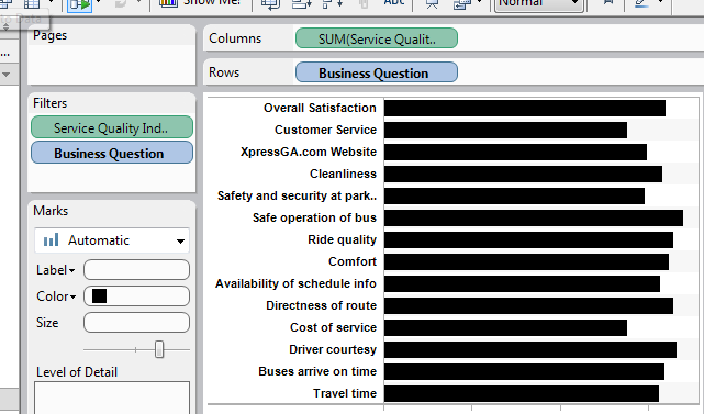
Next I changed the mark type to “Shapes” and moved the “Company” pill to the Shape Shelf. This created an individual shape to represent each vendor. I thought about creating custom shapes that matched the shapes in the original graph to represent each company but I decided to leave the default shapes because I thought it was easier to see through them when two or more companies share the same score on a survey question. 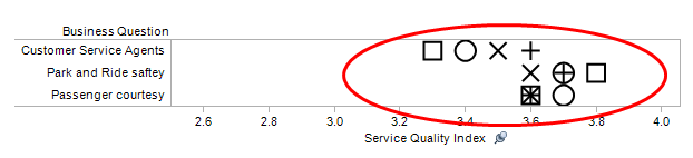

I’m only distinguishing between four vendors. I don’t think these shapes would work well if there were any more than four vendors.
Finally, I added light row banding to help guide the viewer's eye across the chart and I right clicked on the x-axis and selected “Add Reference Line…” which brought up a dialog box where I selected “Band” which shades the range from minimum to maximum. I think the range band works a little better visually than a dark line plus it was easier to make in Tableau.

Here’s the final version recreated in Tableau:

I think the Tableau version is true to the original CAN graph. There are just a few differences. I started the x-axis at zero instead of 2.5 which gives wider and possibly more accurate spacing between the shapes. I used the built-in shapes which are different than the shapes in the original and I used shading instead of a dark line to highlight the range of values on a row.
I can’t wait to use this in my work. Special thanks to Grant Stanley from CAN for letting me link to his blog post and comment on it and hats off to Tadd Wood, also from CAN for designing the chart.