As part of my job I spend a lot of time reviewing analyst’s research on various industries like financial services, customer communications, hosted contact centers, and business intelligence and analytics. Disappointingly, I frequently come across pin-wheel or radar graph-like circular visualizations similar to the one displayed below.

In this image each shape and color combination represents a different vendor in the industry and ranks their overall customer survey scores for each category.
Most of us have heard all the arguments against pie charts and other circular visualizations. This type of visualization is particularly troubling to me because it’s from an analysis of the BI industry where you might expect better. When I see a visualization like this I intuitively want to line up the spokes of the wheel on top of each other like a bar chart so I can compare all the scores for a single vendor. Consequently I end up wasting limited cognitive equity doing visually perceptive somersaults trying to create a virtual horizontal line graph in my head instead of analyzing the vendor capabilities.
To my delight a solution has been brought forward and it comes courtesy of the guys at Contemporary Analysis (CAN) right here in Omaha. In a November blog posting on dashboard design they talked about using a bullet graph versus a bar graph to compare the survey scores of multiple vendors. It’s the same problem that the example above is trying to solve but my buddies at CAN created a visualization that line up the spokes on the wheel for me.
Here’s the link to the original blog post: Dashboard Design: Bullet Graph vs. Bar Chart
This is the CAN graph and it shows the different shapes for each vendor on the same line for each survey question and the questions are stacked on top of each other for easy comparison of a vendor from survey question to survey question.
The CAN Graph

There is also a dark line that shows the distance from the low score to the high score to help the viewer understand the range of scores for each survey question.
This is exactly what I try to do mentally whenever I come across one of those pinwheel radar charts. This visualization worked so well for me that I decided to figure out how to build it in Tableau.
To recreate this chart using Tableau I started with a conventional horizontal bar chart.
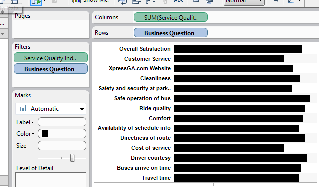
Next I changed the mark type to “Shapes” and moved the “Company” pill to the Shape Shelf. This created an individual shape to represent each vendor. I thought about creating custom shapes that matched the shapes in the original graph to represent each company but I decided to leave the default shapes because I thought it was easier to see through them when two or more companies share the same score on a survey question. 

I’m only distinguishing between four vendors. I don’t think these shapes would work well if there were any more than four vendors.
Finally, I added light row banding to help guide the viewer's eye across the chart and I right clicked on the x-axis and selected “Add Reference Line…” which brought up a dialog box where I selected “Band” which shades the range from minimum to maximum. I think the range band works a little better visually than a dark line plus it was easier to make in Tableau.

Here’s the final version recreated in Tableau:

I think the Tableau version is true to the original CAN graph. There are just a few differences. I started the x-axis at zero instead of 2.5 which gives wider and possibly more accurate spacing between the shapes. I used the built-in shapes which are different than the shapes in the original and I used shading instead of a dark line to highlight the range of values on a row.
I can’t wait to use this in my work. Special thanks to Grant Stanley from CAN for letting me link to his blog post and comment on it and hats off to Tadd Wood, also from CAN for designing the chart.
The fact that GRTA scored the best and CCT the worst is obvious right away with your version. With the radar chart, not so much. Thanks for including the how-to guide in the post as well. Do you think adding color to the shapes would improve it, or just add unnecessary detail?
ReplyDeleteBen, I experimented with some different color schemes and while color was easily distinguishable when there was a clear separation between the shapes, color got in the way when the shapes had some overlap. It got kind of muddy. Since we already distinguish the vendors by shape, color adds unnecessary detail in this type of visualization.
ReplyDeleteMike,
ReplyDeleteThis is a great example of over-visualization of data. One other point I would make in comparing the Radar chart to the much more effective Bullet Chart is that, with a radar chart I'm also tempted to connect the dots between the different axes, which implies a dependency between the questions that doesn't exist. This is an other hidden danger of using this type of chart to display this information.
Also, in your Tableau example, I would have thought the line vs area idea for the reference line/band was more intuitive in the CAN example, simply because, without even looking at the legend I could easily distinguish the more direct relationship between the all(total) and the range(line), than in the tableau example. What would you say the benefits are to using the band as opposed to the line?
Secondly, both charts could benefit from a little text explaining what the "service quality index" means exactly. Without reading your blog post I would have no way of knowing if higher numbers are better than lower numbers for example.
My thoughts,
Nice post! One possible improvement would be to order the categories in a meaningful way - perhaps by median service quality index. Your redesign is similar to one I used in Chapter 8 of Creating More Effective Graphs. ( http://amzn.to/vmUj8I)
ReplyDeleteThanks for the tutorial! Essentially the CAN graph is a dot plot with shapes and a line/band to indicate maximum and minimum values. I'm surprised that Tableau doesn't already have a canned (no pun intended) dot plot view. Also, filtering out all but the line/band would be an easy way to see the range of Service Quality Index values across the 14 metrics.
ReplyDeleteHey, great case study, Mike. Thanks for posting. I immediately saw how the different vendors were ordered on the horizontal axes and the relationship between what they spend (CCT, GCT, GRTA, from lowest to highest) and the quality they get (same order for all but one or two of the quality categories). A few thoughts:
ReplyDelete1. I wonder whether there is a more optimal way of ordering the indicators on the vertical axis to bring out this relationship, if that's what the audience is interested in.
2. There's a tradeoff between including the average (four marks rather than three) and the complexity/readability of the chart. Personally I would prefer to skip the average, especially since there are only three data points.
3. GCT is close to the lowest-cost provider but ranks first in two quality categories: on time arrivals and directness of routes. Related, I guess. Maybe it's an obvious lesson, but worth pointing out.
4. I wonder about comparisons in dollar terms (admittedly hard to do for quality) rather than as a more abstract rating scale. I imagine that's one thing the audience would be pretty interested in - how does a change in costs affect revenues.
It's a visualization that makes you think about the underlying business and business model. Thanks for striking a blow against chartjunk.
@Mike, I might be missing it, but I can't see the connection between the radar chart and The CAN Graph, except that they're both graphs. They appear to have completely different data sets, which makes a comparison between them almost meaningless.
ReplyDeleteIn the original CAN article they compare two designs using the same data, which makes for a valid compare and contrast.
That aside, yours is a nice chart.
@Rob, Tableau does provide dot plots right out of the box.
You're right Chris. They are different data sets. I was primarily focused on seeing if I could use Tableau to duplicate the chart that my friends at Contemporary Analysis built. I didn't even think of duplicating the example of the radar graph that I showed but it's a good idea. I'll do that and post it here. Thanks!
ReplyDeleteTableau Software
ReplyDeleteI work on our Professional Services team.We have Business Consultants that can help in several ways.Our company which is located in London, Here are some of services that we offer.http://www.sqiar.com/solutions/technology/tableau/ Click on the link of that page to send us an email. We'd be happy to help. Professional Services Tableau Software
You can create Radar chart in Excel and Google Sheets without any coding skills.
ReplyDeleteChartExpo™ is both an Excel and Google Sheets data visualization tool to create 50+ custom charts from few clicks.
Try it for Free:
ChartExpo™ for Excel
ChartExpo™ for Google Sheets
Sharing a video to watch how easy to create charts in Google Sheets and Excel.
How to create Sankey Chart?
Thanks.