Wednesday, August 12, 2015

Music Viz Contest Submission - Beatles Writing Contributions by Album

A couple of weeks ago I read a really interesting article on Pixable.com by Mitchell Friedman that asked the question; who was the most prolific writer in the Beatles?

Friedman used data from the William J Dowlding 1989 book “Beatlesongs”. The content was very interesting but the data was unfortunately presented using individual pies charts for each album. And they were not good pie charts either. The slices in the pie were not a solid color but rather a picture of each Beatle they were meant to represent.

The two big questions that I had as I read through were how did the writing mix change from album to album and how did it trend by artist year over year? For instance was John contributing more or less by the end of the Beatles career? When did George emerge as a consistent contributor? Was Ringo ever a contributor? These questions could be answered of course with a lot of scrolling and comparing back and forth but that is a lot of work when it all could be presented simply and cleanly in a single visualization.

My first thought was that this screams for Makeover Monday from VizWiz himself, Andy Kriebel. But my second thought was the timing was perfect with the third Iron Viz feeder contest coming up. I haven’t really been motivated to enter one of these in a while so I figured this is the excuse I need to do this makeover myself.

There are no complex hacks or over the top designs. I always try to keep my dashboards very clean and simple. Lots of whitespace. Usually monochromatic and other colors only when needed to serve a purpose. I’ll admit there are more images than I usually include which take up valuable space needed for data but I felt I needed something the draw people into the viz. Plus I like the images and it fits with classic early Beatles branding.

I hope this viz tells Friedman’s story a little better than his website editors did. At any rate, this exercise answered the questions I was left with after reading the article.


Monday, October 15, 2012

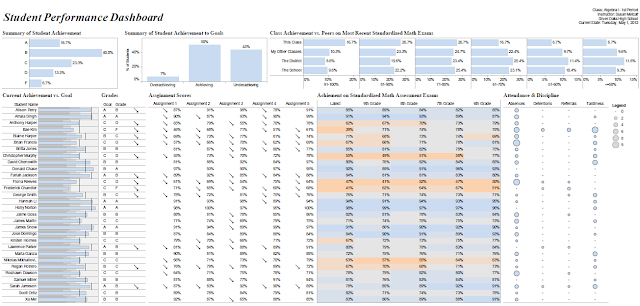
My Entry in the 2012 Perceptual Edge Dashboard Design Competition

Congratulations to the winners of the 2012 Perceptual Edge Dashboard Design contest, Jason and Shamik.  Great work!  Their entries can be found here: http://www.perceptualedge.com/blog/?p=1374

You can see some of the other entries by going to http://www.perceptualedge.com/discussion.htm and look for the Dashboard Design subject.  Here's my entry created in Tableau - of course!  As always, any and all feedback is welcome.  Thanks!

Click on the image to open in Tableau Public


Friday, June 29, 2012

My Entry for the Tableau Interactive Sports Viz Contest

The Pitcher Effectiveness Rating is an indication of a pitcher's effectiveness and future performance according to fantasy baseball site Rotoworld.com.
"A pitcher's effectiveness is closely tied to the number of baserunners he allows and the number of strikeouts he gets. This table uses a rating system of K/BB + K/9IP - (BB+H)/9IP - HR/9IP. This formula is best used as an indicator of future performance of a pitcher. A pitcher may have a low era after 15-20 innings, but may not have been pitching as effectively as the era indicates. A look at this rating system will be a good way to tell if the pitcher will continue with the low era or will soon run into some trouble."
This is a metric that is screaming to be visualized.  The visualization uses Lahman's Baseball Database to let users explore the relationship between the Pitcher Effectiveness Rating and the individual metrics that combine to make the rating.  Users can drill into different eras over baseball's past and look for changes in the rating based on the pitchers age and the total number of innings pitched over a career.


Click on Image to Explore

Tuesday, March 27, 2012

Fantasy Baseball Time!

Well I'm back after neglecting my blog for awhile.  Here's my first feeble attempt at creating at fantasy baseball dashboard with Tableau on top of an extract from mysql database populated with Lahman's baseball data.


Friday, January 20, 2012

This Rise of Geofluence

One of the most popular data visualization techniques enabled by the proliferation of data visualization software is to show a map with color filled regions based on some data point that is tied to that region.  The most prominent examples are the red state/blue state maps that we see every time we have a national election.

Yesterday Dan Murray from Interworks was speaking to the Nebraska chapter of DAMA (Data Management International) about data visualization and said that color, shape, size, and position helps data information standout.  No data visualization technique makes better use of color, shape, size and position than a color filled map. 


This week Tableau 7.0 was released which includes new visualization features including the ability to create filled maps.  This data visualization technique is also known as geo-mapping and thanks to the new Tableau release all of us have the ability to create beautiful color filled maps that can help influence and tell stories.  You could call it "geo-fluence" and it can be a very powerful tool that can tell vastly different stories depending on how you apply it.

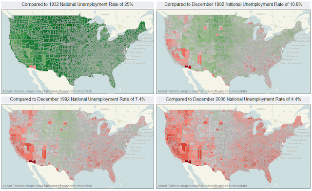
To illustrate this point I took October 2011 unemployment rates by county that I got from the Bureau of Labor Statics and loaded them into Tableau.  Then I created four views that compares the unemployment rates by county to the national average from four different time periods.  The first time period compares 2011 unemployment rates to the 25% unemployment rate at the height of the Great Depression.  The second map compares 2011 unemployment rates to the recession which ended in November 1982.  The third map compares unemployment rates to rates just before the start of Bill Clinton's first term and the last map compares unemployment rates to rates from five years ago.


As you can see each map tells a different story.  Current unemployment looks terrible if you are comparing 2011 rates to the kind of unemployment rates we saw during the late 90's and the mid 2000's but when compared to the Great Depression or even the recession of the early 1980's they don't look too bad.  And while all of these maps tell very different stories none of them are factually incorrect.  They simply present the data in a different context.

Geomapping fulfills the primary objective of data visualization.  It communicates data in an intuitive manner that lets the viewer instantly understand the information being presented.  It's also very easy to misrepresent or mislead the viewer if proper context if not given.  Giving your audience proper context to help tell a story and influence perception is an acceptable use of data visualization.  Failing to provide context and misrepresenting the data or misleading your audience is not acceptable.

Once thing does seem to be true however.  Regardless of the context, it's appears that Yuma county Arizona is a tough place to find work!

Tuesday, January 17, 2012

Tableau 7 is out!

It works!  Here's some unemployment rates by county that I was working with last year.  Red bad, green good.  Glad I live in Nebraska!

Click on the image to open the workbook.